Medstar Health Digital Style Guide
In 2017 MedStar Health’s digital platforms straddled an older print-based style that overlooked common usability and accessibility concerns and various new more experimental styles which improved the aesthetics and usability of the older style but lacked consistency between properties. In order to streamline and improve the user interface design process moving forward a digital style guide was created. The digital style guide combined elements from the brand guide that MedStar Health viewed as crucial for brand recognition with the most successful elements from across the more newly released platforms. Key focus’ included; accessible content and language, responsive design, and creating a simple yet flexible set of rules for any designer to follow.
medstar health
asset design + documentation + copywriting + icon design
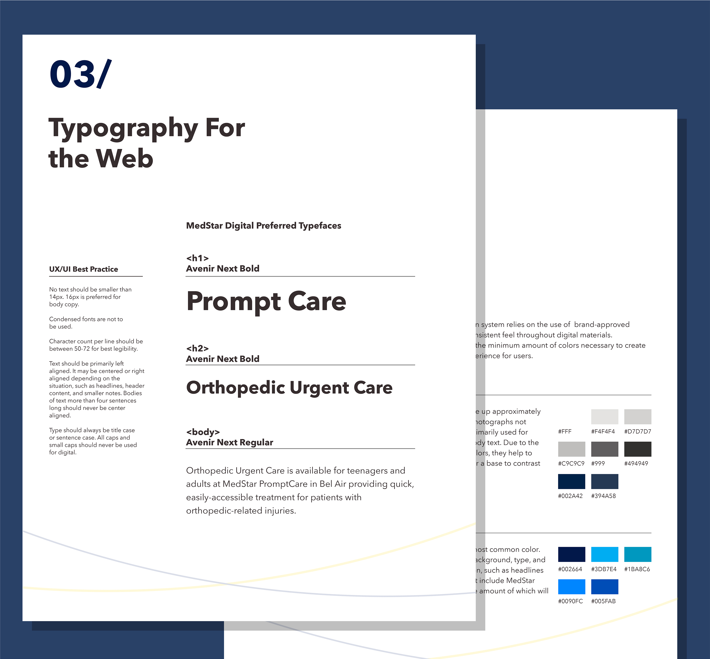
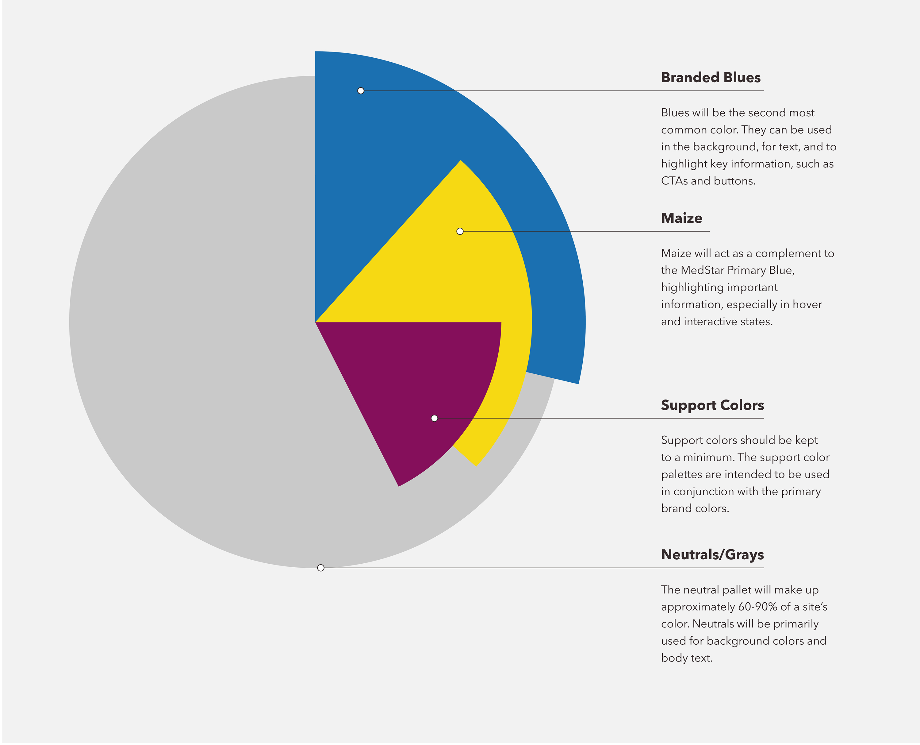
Typography and colors were an obvious starting point for the new style guide. The expansive pallet and type choices from MedStar Health’s Brand guide were simplified to help encourage consistent and frequent use of assets critical for MedStar’s brand recognition.

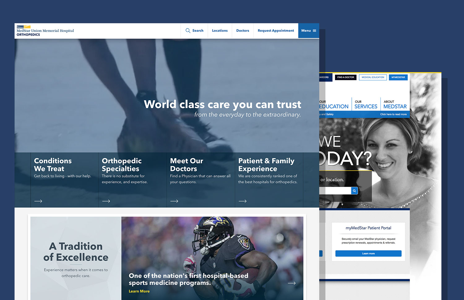
A highly successful project of MedStar Health’s was their triage site MedStar Now. The style of this site was unlike anything they had done before and was a great stepping stone for stylistically defining their retail sites. A unique and comfortably relatable aspect of this design was the use of illustration. Taking this simple and inclusive style, rules were written for how and when illustrations should be used so that they could be most effective and situationally sensitive.
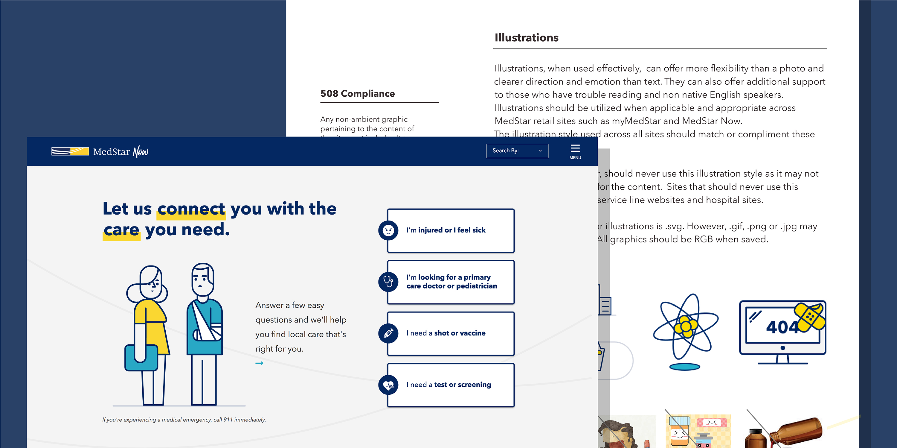
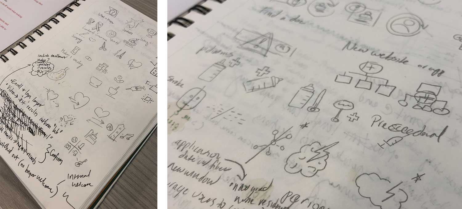
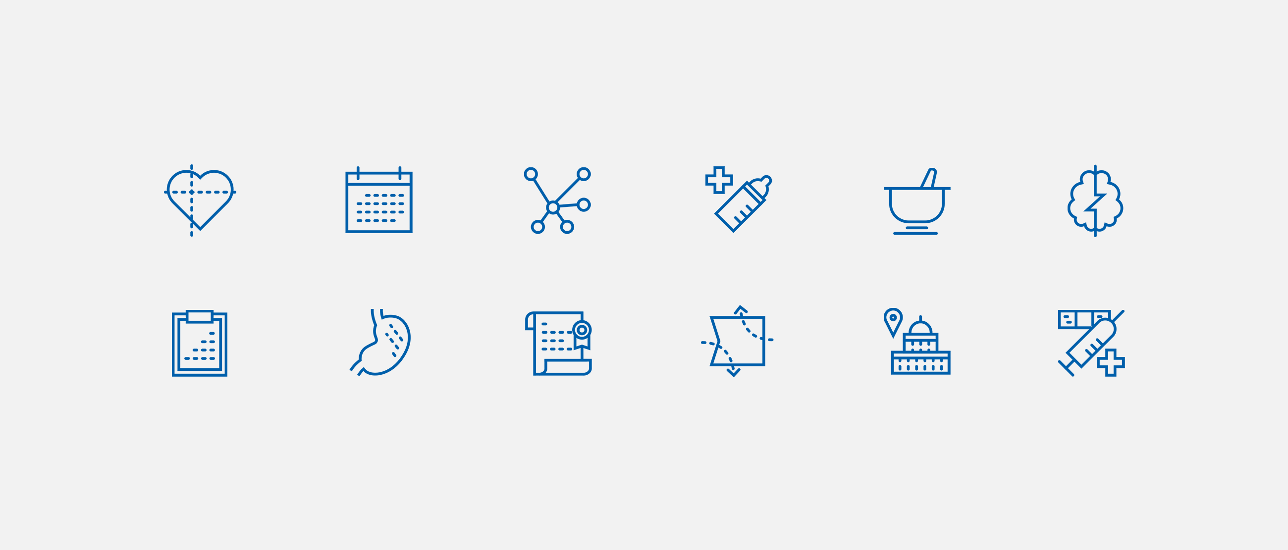
Based on the illustration style, icons sets were developed to be used on different platforms. Though similar, the styles vary to most appropriately fit their use.