ACGI Design System
In late 2018 ACGI brought on a new product team in order to freshen up their robust, but not always user-friendly software. As a first step to improving the software a new design system was created to be implemented throughout.
acgi software
asset design + documentation + copywriting +
library creation + motion graphics
Because of its attention to detail, familiarity, and largely
accessible styles; Google’s material design standards were used as a
starting point to expedite the creation of ACGI’s design system.
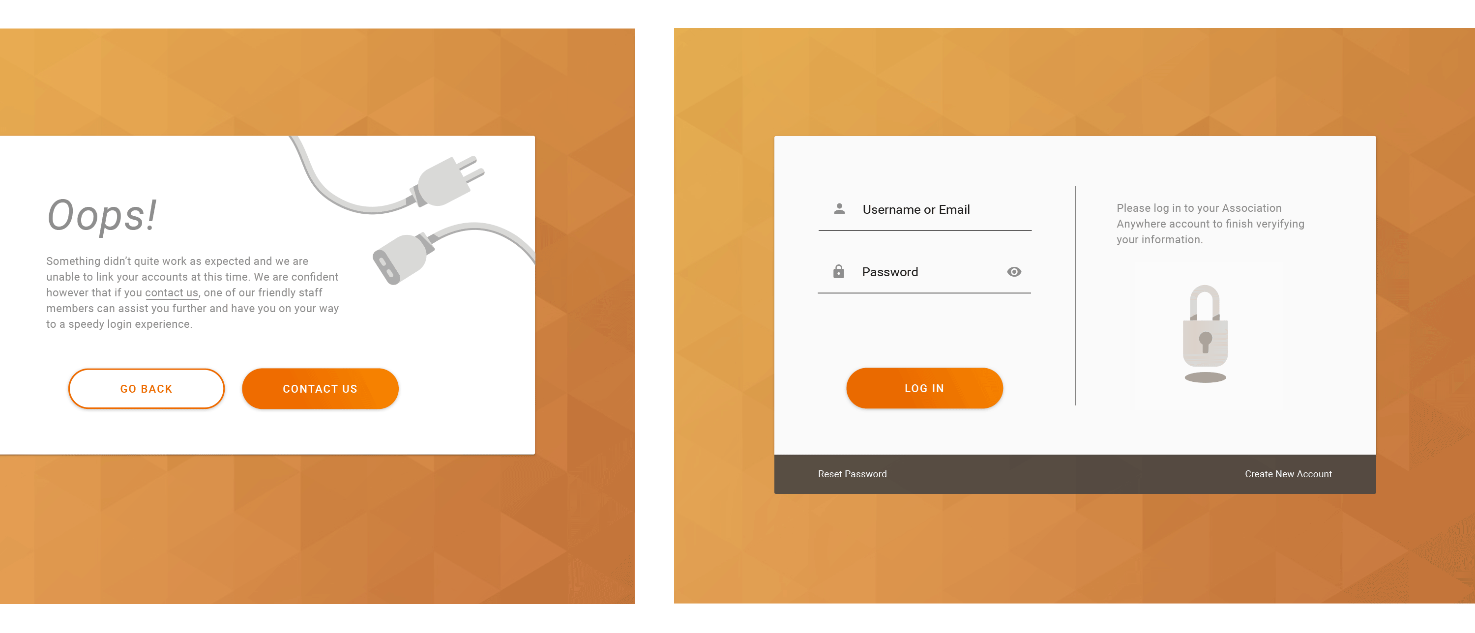
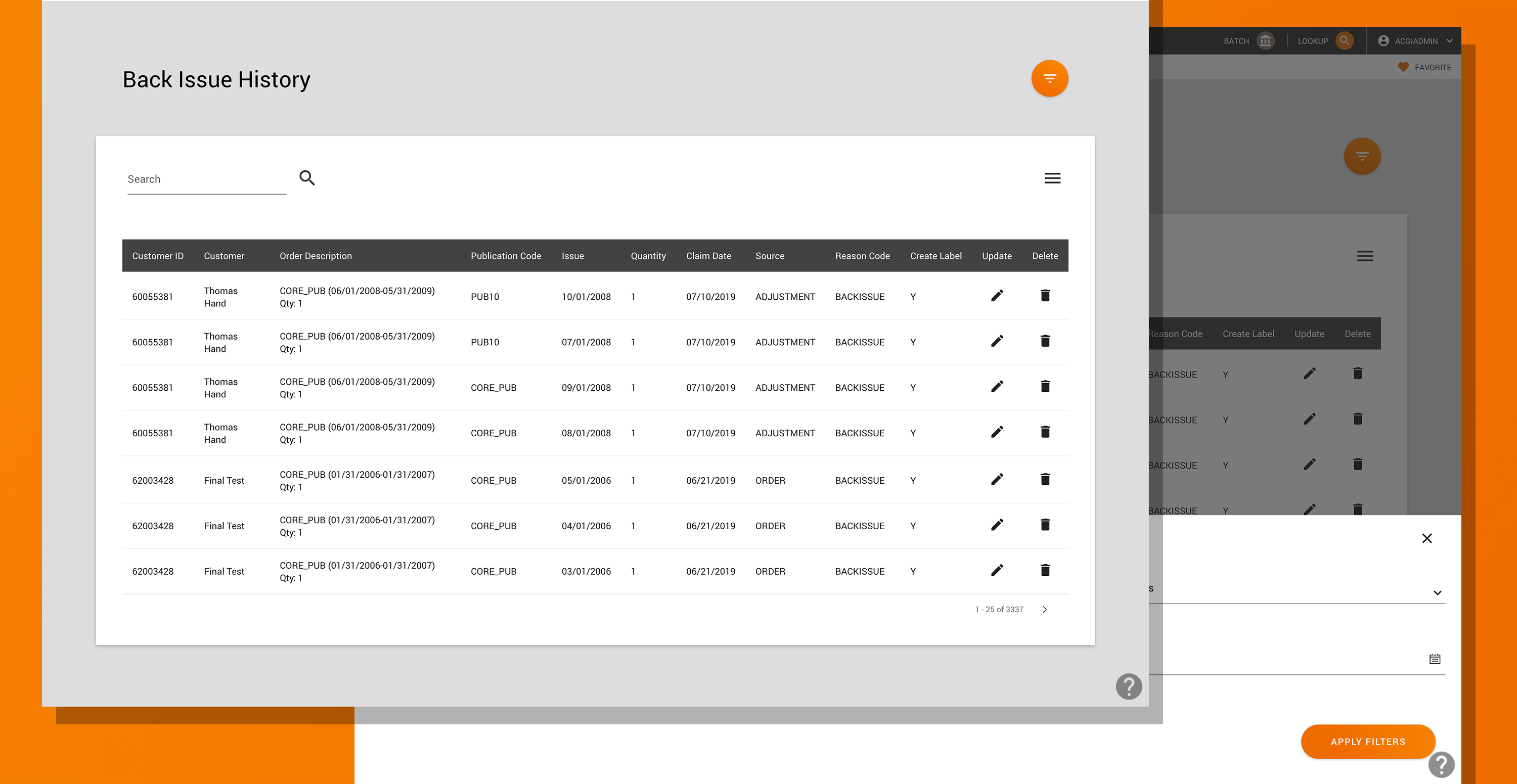
Colors, shapes, graphics, and animations unique to ACGI were applied
to create a sophisticated yet inviting style throughout the
software.
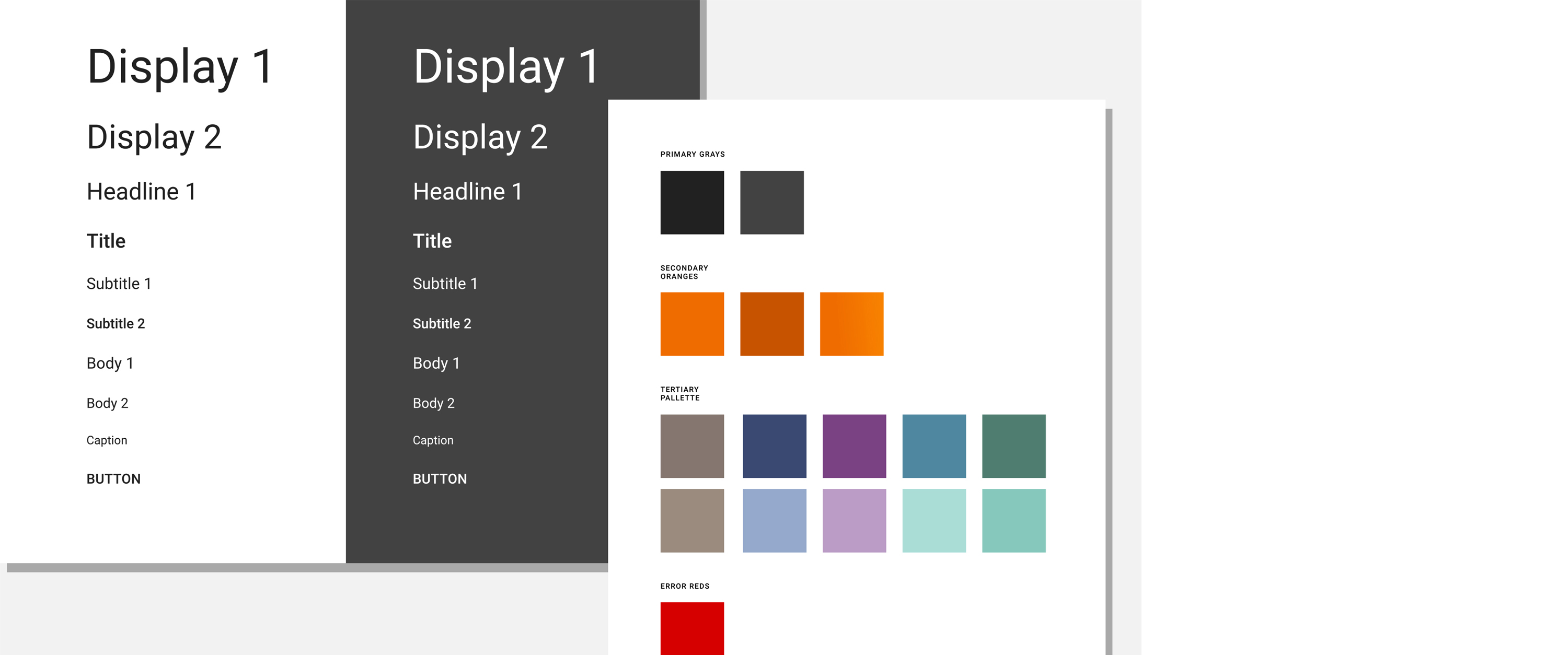
The driving rationale behind selecting these new styles was; brand
adherence, accessibility, and what could help to create the most
visually enjoyable experience for our users.
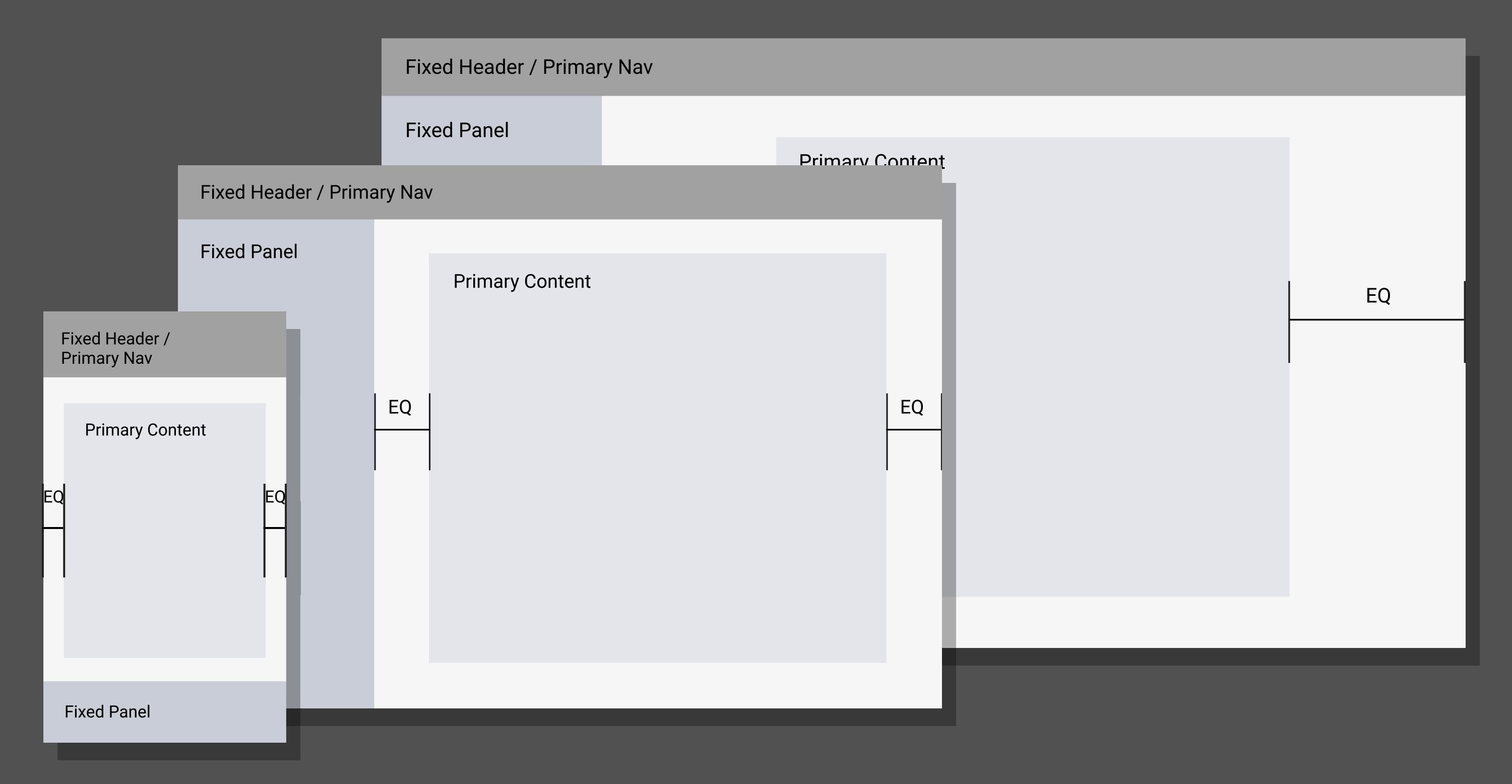
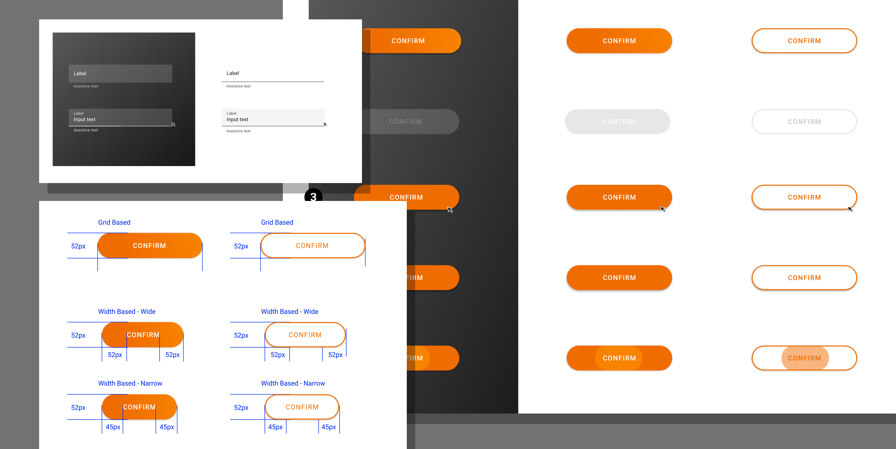
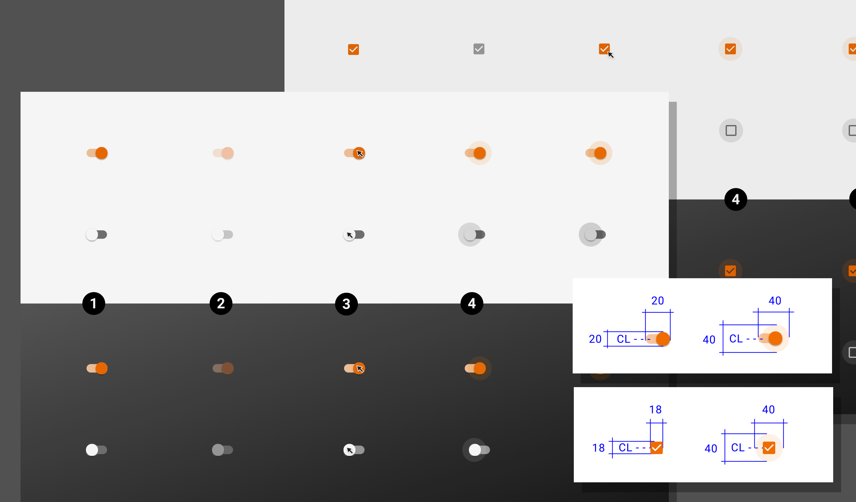
Documentation was created both for designers and developers. Shared
libraries were created in Figma, and detailed notes were documented
on a team wiki. Because of the two different user groups, both the
philosophy behind the design as well as concrete specs and usage
guidelines were meticulously noted.
As new projects emerged and new standards were needed, documentation
would be modified and assets would be updated across the software.