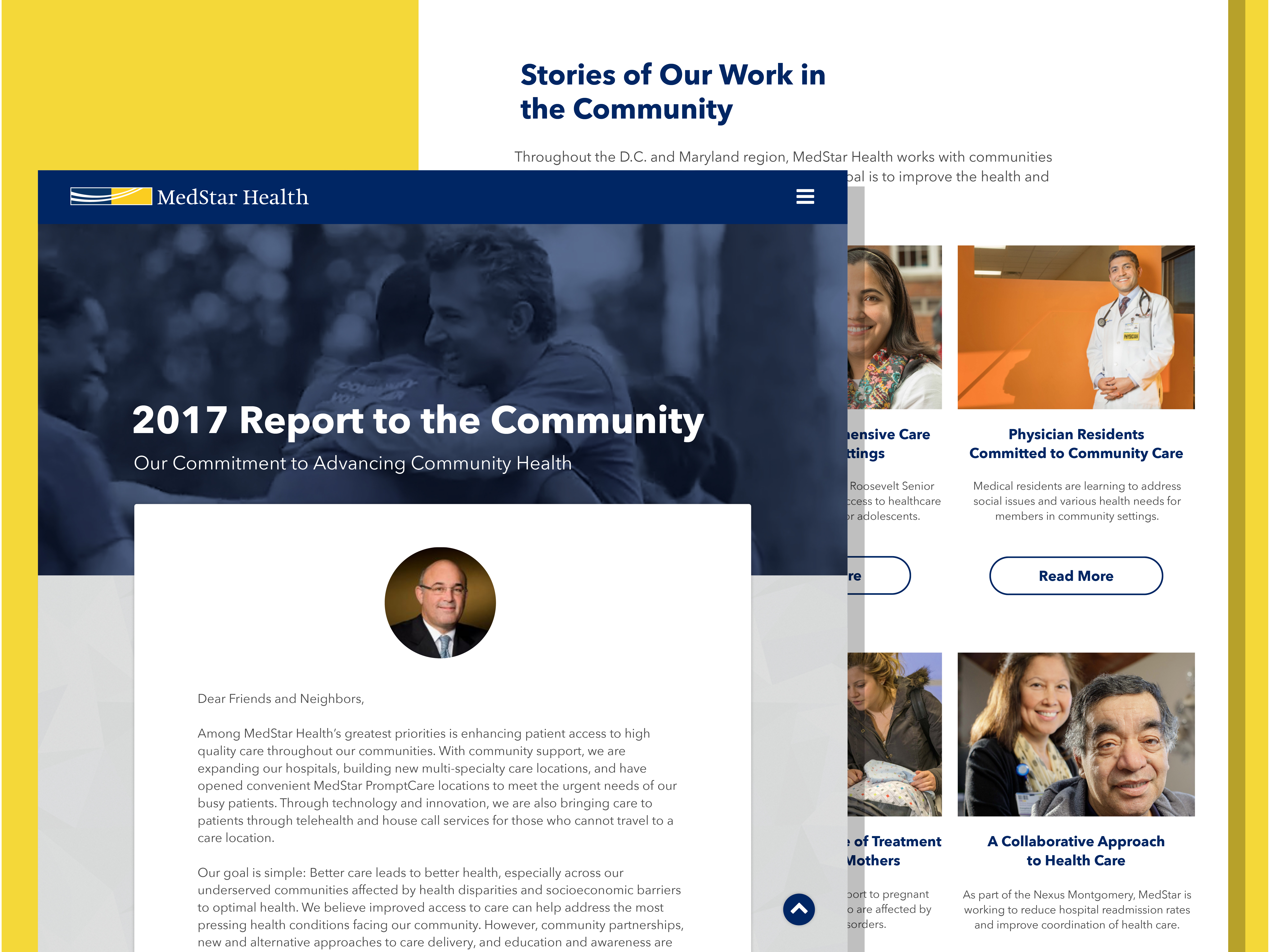
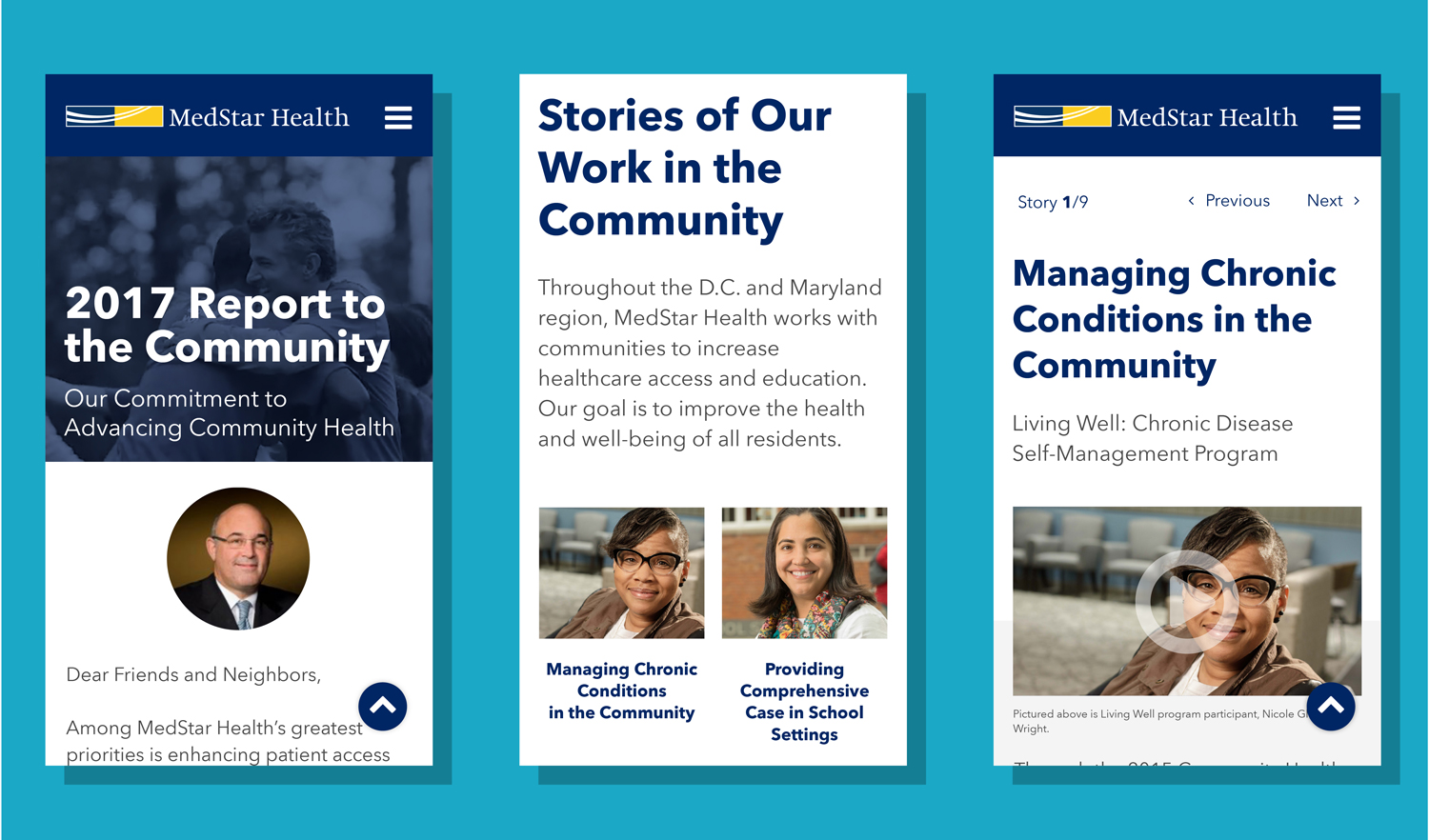
2017 Report to the Community
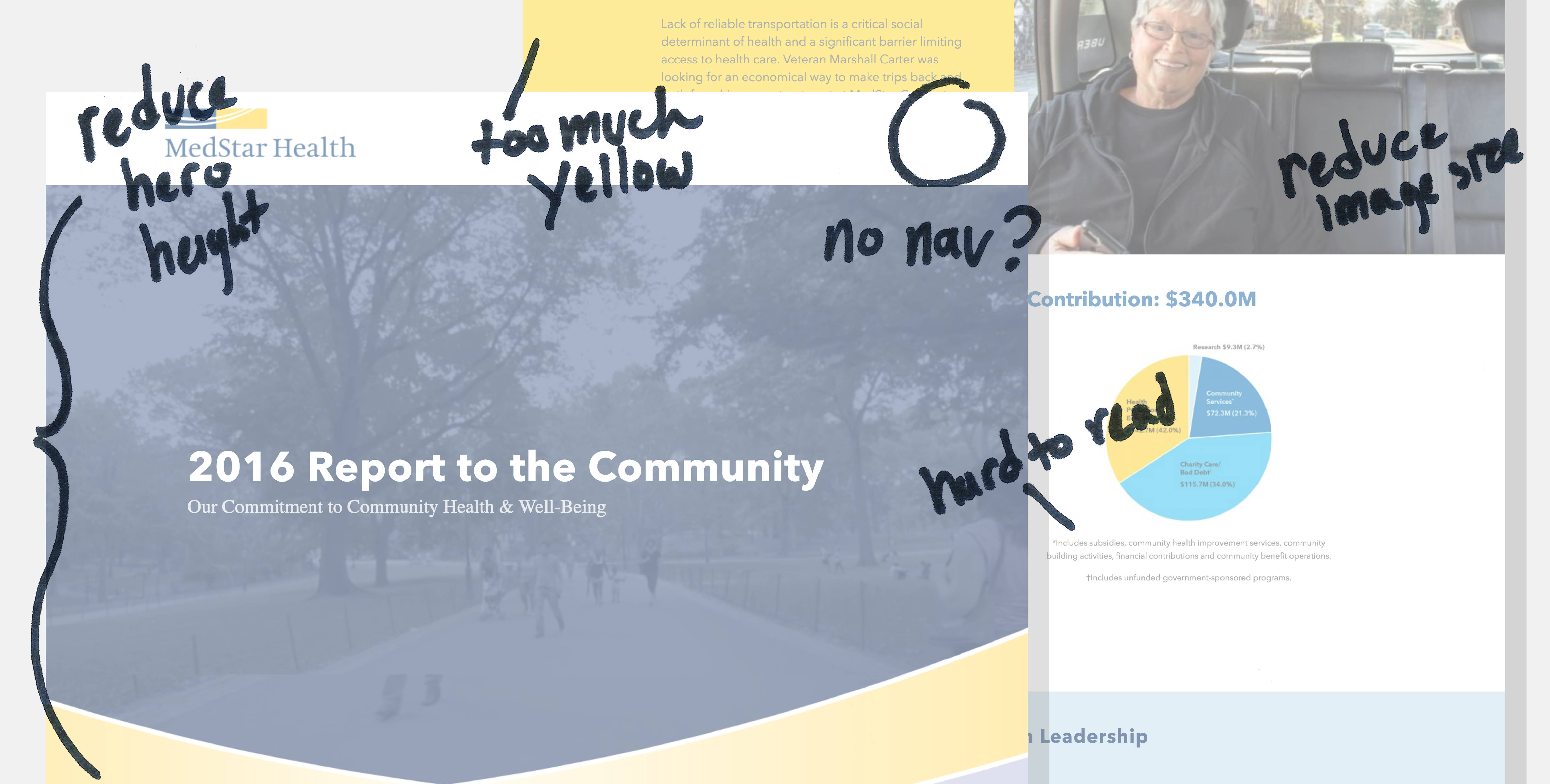
Less than a month out from the required launch date of MedStar Health’s annual Report to the Community, it was brought to the digital team’s attention that there were tracking and usability issues with the report. The navigation was hidden, an excessive amount of scrolling was required, type was hard to read, and only after delving into the project did we realize there was no way for the community to engage with the site or participate in the programs it promoted.
Because there was little budget and time available, we utilized
existing styles and common features our developer was already
familiar with. To further expedite development digital decided that
because only minor updates would be made once live, no CMS would be
needed.
To help make the report easier for users to read and navigate;
distracting colored backgrounds were removed; large headlines, body
copy and images decreased in size; and a three column grid was
implemented on the homepage to condense content.
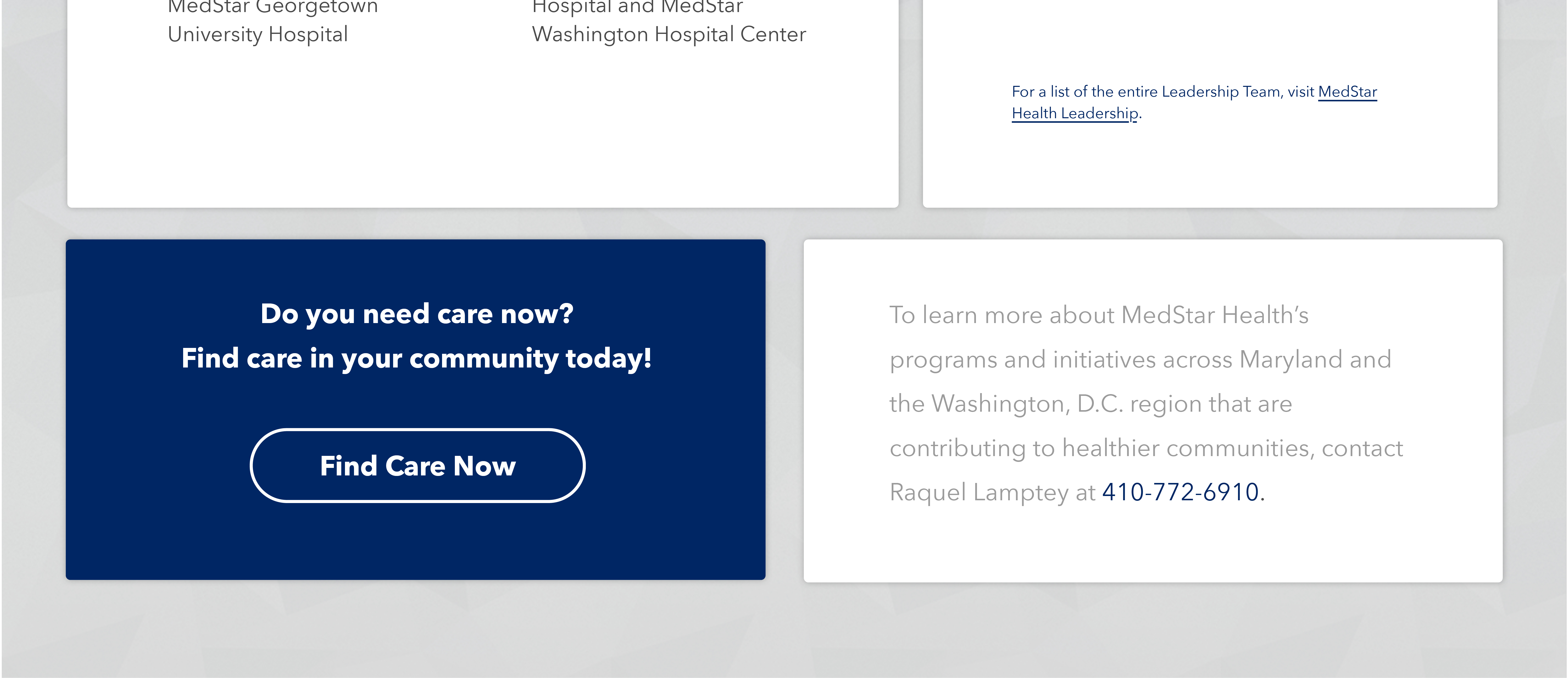
A new area was also added to the bottom of all pages in order to help serve our community. Two boxes were put in place. One box was to advertise MedStar Now, a new product launched to help triage patients as effortlessly as possible. The other serves as a clear means of contact for community members interested in our programs.
Within two months of launch, the 2017 Report to the Community had seen a 134% increase of engaged users from the 2016 report.